Researched Guide
Compiled from public and official sources; not based on a visit.
Color sets the emotional tone of a luxury home. In Charlotte's design community, 2025 marks a decisive shift away from the all-gray interiors that dominated the past decade toward richer, more confident palettes that create warmth, depth, and personality. Here's what's defining Charlotte's most sophisticated interiors this year.
The End of Gray
After a decade of gray walls, gray floors, and gray everything, Charlotte's luxury market is moving on. Gray hasn't disappeared entirely—it remains a useful neutral in certain contexts—but it's no longer the default. Designers report that clients are increasingly requesting color with character, not the absence of it. This evolution reflects a broader societal desire for authenticity and personal expression, moving beyond a one-size-fits-all aesthetic that characterized much of the previous decade's design trends. In Charlotte, a city known for its blend of Southern charm and sophisticated urban living, this shift is particularly pronounced in affluent neighborhoods like Eastover, Myers Park, and the SouthPark area, where homes often feature expansive windows that previously highlighted the coolness of gray, but now benefit from the welcoming embrace of warmer hues.
Warm Whites and Creamy Neutrals
The most significant shift is from cool gray-whites to warm, creamy whites. Colors like Benjamin Moore's White Dove, Sherwin-Williams' Alabaster, and Farrow & Ball's Pointing create backgrounds that feel welcoming rather than clinical. These warm whites complement Charlotte's abundant natural light and pair beautifully with the natural wood tones that are trending in cabinetry and furniture. This trend is particularly relevant for Charlotte's burgeoning market of modern farmhouse and transitional-style luxury homes, where a soft, inviting backdrop is key. For instance, a home in a well-regarded school district like Myers Park High School zone might feature White Dove throughout its main living areas, creating a seamless flow that feels both elegant and comfortable, a stark contrast to the starker grays that once prevailed. These creamy neutrals also act as an ideal canvas for the rich textures and accent colors that are gaining popularity. They offer a sophisticated foundation that allows statement pieces, whether they be vibrant artwork or intricately carved furniture, to truly shine without overwhelming the senses. The perceived value of such homes often increases when designers employ these sophisticated neutral palettes, suggesting an attention to detail and an understanding of timeless design principles.
Earth Tones and Nature-Inspired Palettes
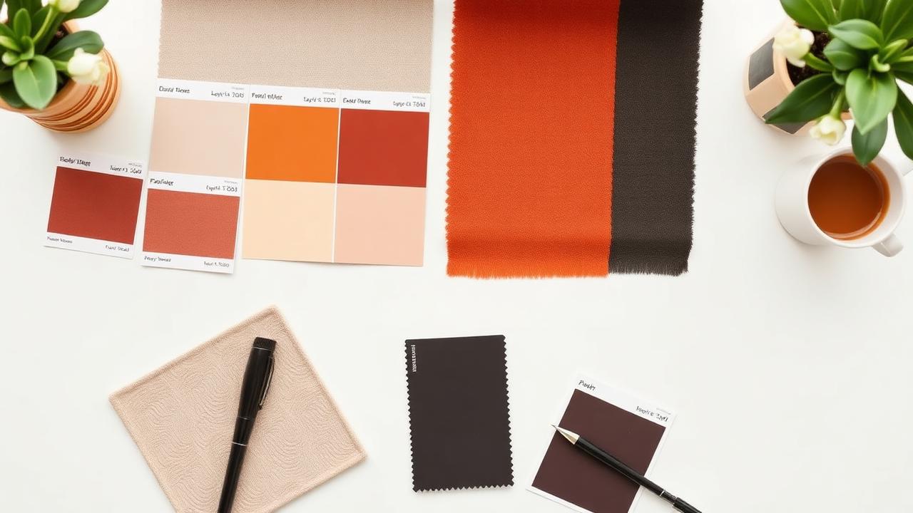
Charlotte's connection to the Carolina landscape is reflected in interiors inspired by nature. Terracotta, sage green, warm clay, and mushroom tones create organic palettes that feel grounded and sophisticated. These colors work particularly well in homes that emphasize indoor-outdoor connection, creating visual continuity between interior spaces and the natural environment. Think of homes nestled near the U.S. National Whitewater Center or those with sweeping views of the western North Carolina foothills; these palettes bring the tranquility of the outdoors in. Sage green, for example, can create a serene retreat in a primary bedroom, while a touch of terracotta can add warmth and depth to a living room fireplace surround. The popularity of these earthy tones also aligns with a growing interest in sustainable and biophilic design, appealing to Charlotte homebuyers who value wellness and environmental consciousness. Local businesses like PlantJoy, which offers extensive indoor plant selections, can further enhance this connection, providing living decor that complements the earthy color schemes and breathes life into spaces. This trend isn't limited to large estates; even in the more urban settings of Uptown or Elizabeth, carefully chosen earth tones can evoke a sense of calm and natural beauty.
Sage Green: The New Neutral
Sage green, in particular, has emerged as a standout color, transcending its traditional association with kitchens and bathrooms to become a versatile hue for entire rooms. Its muted, sophisticated tone offers a calming effect, making it ideal for primary bedrooms, meditation spaces, or formal living rooms. In Charlotte's luxury market, designers are showcasing sage green not just on walls but also in cabinetry, upholstery, and even as a primary color for custom drapery, often paired with natural wood finishes or warm brass accents for a touch of elegance. This color evokes the lush greenery of local parks like Freedom Park and Wing Haven Garden and Bird Sanctuary, making it a deeply resonant choice for Charlotte residents.
Terracotta and Clay: Adding Warmth and Depth
Warm terracotta and muted clay tones bring a Mediterranean or Southwestern flair, adding an earthy richness that is both inviting and timeless. These shades work exceptionally well as accent walls, in artisanal tile applications in kitchens and bathrooms, or in larger format pieces of furniture. They provide a sense of history and groundedness, making modern luxury spaces feel more established and lived-in. Consider a statement wall in a dining room treated with a limewash in a deep terracotta, paired with dark wood furniture; it creates an intimate and dramatic atmosphere perfect for entertaining guests in neighborhoods like Dilworth or Madison Park where historic charm meets modern living.
Mushroom and Taupe: Sophisticated Earthy Neutrals
Mushroom and warm taupe shades offer a more contemporary take on earthy neutrals. These colors bridge the gap between warm grays and true browns, providing a sophisticated, understated backdrop. They are perfect for creating a serene and cohesive feel throughout a home, especially in open-concept living spaces common in newer constructions in areas like Ballantyne or Weddington. These tones pair beautifully with a variety of materials, from polished concrete floors to rich, hand-knotted rugs, adding layers of subtle color and texture.
Deep, Saturated Accents
Bold accent walls and statement spaces are back—but with more sophistication than the accent walls of the 2010s. Deep forest greens, rich navy blues, warm burgundies, and saturated charcoals create drama in libraries, dining rooms, and primary suites. The key is using these bold colors strategically, not everywhere. A dramatic navy blue library, perhaps in a historic Charlotte home requiring careful preservation, can be a stunning focal point, while a deep emerald green can lend a jewel-box feel to a powder room. These colors are often paired with contrasting textures, like velvet upholstery or high-gloss lacquered finishes, to enhance their luxurious appeal. The strategic use of these deep hues adds personality and depth, transforming a space from merely functional to truly memorable. This approach resonates with discerning buyers who appreciate curated design and a sense of individuality in their homes. Consider the classic charm of a deep burgundy accent wall in a formal dining room, providing a dramatic backdrop for family gatherings, a style that harks back to the elegant estates of the Queen City's past, reimagined for today.
Forest Greens and Emeralds: A Touch of Opulence
Deep, rich greens like forest green and emerald are making a strong statement, particularly in areas of the home dedicated to relaxation or intellectual pursuit. These colors can transform a study into a sophisticated retreat or add a touch of opulence to a sitting room. When paired with brass fixtures, dark woods, and natural materials, they evoke a sense of timeless luxury. For instance, a custom-built executive home in a golf course community like Quail Hollow might feature emerald green velvet accent chairs in the primary suite, adding a luxurious pop against a backdrop of warm neutrals.
Navy Blues and Indigos: Classic Sophistication
Navy blue and deep indigo hues continue to be incredibly popular, offering a sophisticated alternative to black. They are versatile enough for a statement piece of furniture, an accent wall in a bedroom, or even an entire media room for a dramatic theater-like effect. These colors pair well with a range of materials, from crisp white linens to warm leather, and add a sense of depth and calm to any space. In Charlotte, a city with a strong corporate presence, these blues can evoke a sense of stability and professionalism, appealing to buyers who are building their lives and careers here.
Burgundies and Deep Reds: Warmth and Intimacy
Warm burgundies and deep, muted reds are injecting a sense of passion and intimacy into luxury interiors. These hues are perfect for creating a cozy and inviting atmosphere, especially in dining rooms or libraries. They can be used on walls, in upholstery, or as accents in artwork and accessories, adding a touch of old-world charm and comfort that feels particularly relevant in the current design climate. Imagine a stately home in the historic Fourth Ward district featuring deep burgundy velvet banquettes in a breakfast nook, adding a regal yet comfortable feel.
Kitchen Color Evolution
Charlotte's luxury kitchens are moving beyond all-white. Two-tone cabinetry—darker lower cabinets with lighter uppers, or a contrasting island—adds visual interest. Designers at Emerald & Oak Design report increasing demand for sage green, navy blue, and warm greige cabinetry that creates kitchens with more personality than the all-white standard. This trend is evident in high-end developments across Charlotte, from the custom builds in Mountain Island Lake to the refined downtown condos. The integration of color allows for a more personalized aesthetic, reflecting the homeowner's unique taste. Two-tone cabinetry, a popular execution of this trend, offers a dynamic visual appeal. For example, deep navy lower cabinets paired with white or light wood uppers create a sophisticated contrast that grounds the space. Alternatively, a statement island in a bold color like deep green or rich burgundy can serve as the kitchen's focal point, drawing the eye and adding a layer of bespoke charm. The choice of hardware also plays a significant role; matte black, brushed brass, or even oil-rubbed bronze can further enhance the cabinetry's color and overall kitchen design. This move away from monochromatic kitchens reflects a broader shift towards creating spaces that are not only functional but also visually engaging and reflective of personal style.
Two-Tone Kitchens: A Dynamic Approach
The two-tone kitchen trend offers a sophisticated way to add depth and visual interest. Pairing darker hues on lower cabinets with lighter tones on uppers creates a sense of grounding and openness simultaneously. Alternatively, a contrasting color for the kitchen island can provide a striking focal point. This approach is particularly effective in larger kitchens found in estates in Weddington or the Lake Norman area, where zoning different areas through color can enhance the flow and functionality of the space. Many Charlotte custom cabinet makers are now offering a wider palette of customizable colors to meet this growing demand.
Cabinetry in Muted Jewel Tones
Beyond the popular earth tones, muted jewel tones are also making waves in luxury kitchen design. Think of deep teal, muted amethyst, or a sophisticated olive green for cabinetry. These colors offer a richer, more decadent feel than pastels, while still maintaining a sense of elegance and restraint. They pair beautifully with natural stone countertops, such as Calacatta or honed black granite, and brass or matte black hardware, creating kitchens that are both visually stunning and highly inviting.
Bathroom Color
Luxury bathrooms in Charlotte are embracing color through tile, vanity finishes, and wall treatments. Warm stone tones—travertine, limestone, and warm marble—create spa-like environments. Green marble and veined natural stones serve as statement materials that define the room's character. The focus is on creating serene, spa-like retreats, a stark contrast to the sterile white bathrooms of the past. In primary ensuites within high-rise condos in Uptown or expansive homes in SouthPark, the trend is towards natural materials that bring warmth and texture. Travertine tile, with its natural variations in color and texture, can create a sense of timeless elegance. Limestone offers a softer, more muted palette, perfect for achieving a tranquil atmosphere. For those seeking a more dramatic statement, veined natural stones like green marble or deep blue lapis lazuli are being incorporated as accent walls, vanity tops, or shower surrounds. These materials, often sourced from quarries around the world, add a unique element of luxury and artistry to the bathroom. The trend also extends to smaller powder rooms, where bold wallpaper in botanical prints or moody floral patterns can create a memorable first impression for guests. This move towards color and natural materials signals a desire for bathrooms that are not just functional but also restorative and aesthetically pleasing.
Spa-Like Serenity with Natural Stones
The allure of natural stone continues to grow, with warm-toned marbles, travertine, and limestone taking center stage in Charlotte's luxury bathrooms. These materials bring an inherent warmth and organic beauty, creating serene and sophisticated environments. Whether used for flooring, wall cladding, or vanity tops, these stones add depth, texture, and a touch of timeless elegance, transforming ordinary bathrooms into private sanctuaries. Imagine a primary bathroom in a custom home in Cramer's Pond featuring a freestanding tub surrounded by honed travertine tiles and a double vanity topped with warm veined marble.
Statement Tiles with Color and Pattern
Beyond the natural stone, bold patterned tiles in rich colors are making a comeback, especially in shower stalls and as accent backsplashes. Think intricate geometric patterns in deep blues and greens, or floral motifs in muted jewel tones. These tiles add personality and artistic flair, turning functional areas into design focal points. In a guest bathroom, a wall of hand-painted Portuguese tiles in a vibrant blue and white pattern can add a unique character that guests will remember.
Exterior Color Trends
Charlotte's exterior palette is shifting from the ubiquitous light gray and white toward warmer tones. Warm putty colors, soft sage, and warm charcoal create street presence without competing with the landscape. Dark-painted front doors in black, deep green, or navy blue provide contrast and architectural punctuation. This evolution is visible across Charlotte's diverse neighborhoods, from the historic bungalows of Plaza Midwood to the modern farmhouses in Union County. The preference for warmer, more muted exterior colors reflects a desire for homes that blend harmoniously with their surroundings, whether that be mature trees in Myers Park or manicured lawns in Ballantyne. Soft sages and warm putty colors offer a welcoming and sophisticated appearance, while warm charcoals provide a contemporary edge without the harshness of stark black. The front door, often considered the home's handshake, is becoming a key element for expressing personality. A classic black door offers timeless elegance, while a deep forest green or navy blue can add a unique character that complements the overall exterior palette. These conscious color choices contribute significantly to the curb appeal and overall perceived value of a luxury property in the Charlotte market.
Warm Neutrals for Timeless Appeal
Exterior palettes are embracing warmer neutrals like creamy beiges, soft taupes, and warm greiges. These colors offer a sophisticated and inviting look that complements the natural beauty of Charlotte's tree-lined streets and surrounding landscapes. They provide a versatile backdrop for various architectural styles, from traditional to transitional, ensuring lasting appeal.
Sage and Earthy Greens for a Natural Connection
Soft sage, olive, and other earthy green tones are increasingly being used on exteriors, reflecting Charlotte's lush, green environment. These colors connect the home to its natural surroundings, offering a sense of tranquility and understated elegance. They work particularly well with natural materials like brick and stone, common in many older and newer Charlotte homes.
Charcoal and Deep Grays as a Sophisticated Alternative
While warm neutrals and greens are on the rise, sophisticated deep grays and charcoals are also gaining popularity as an alternative to lighter grays and whites. These darker hues add a modern, dramatic flair and can make architectural details pop, especially when contrasted with lighter trim or a vividly colored front door.
Statement Front Doors
The front door is no longer an afterthought. Dark, saturated colors—classic black, deep navy, forest green, rich burgundy—are popular choices to create a welcoming yet dramatic entrance. This bold statement piece adds personality and architectural interest to the home's facade, acting as a confident introduction to the refined interiors within.
The Role of Texture
Color in 2025 isn't just about hue—it's about how color interacts with texture. Lime-washed walls, textured plaster, grasscloth wallcoverings, and natural stone surfaces create depth and movement that flat paint simply can't achieve. These textural treatments add sophistication that photographs can't fully capture but that transforms the experience of being in the space. Consider the tactile appeal of a limewashed accent wall in a dining room in a historic Charlotte home, or the subtle intricacy of grasscloth in a master bedroom suite. These elements bring a sensory richness to the home, engaging more than just the visual sense. In luxury properties, the layering of textures is paramount. A smooth, cool marble countertop might be paired with rough-hewn wooden cabinetry, or a plush velvet sofa might sit atop a natural jute rug. This interplay between color and texture creates spaces that feel dynamic, inviting, and deeply personal. High-end Charlotte developers and designers are increasingly specifying these materials to differentiate properties and appeal to a clientele that values craftsmanship and nuanced design. The feeling of a space is often as important as its appearance, and texture plays a crucial role in evoking specific moods and experiences within a luxury residence.
Limewashed and Textured Walls
The resurgence of limewash and textured plasters brings an artisanal, organic feel to interiors. These finishes create subtle variations in color and light reflection, adding depth and character that a flat paint finish cannot replicate. They lend themselves beautifully to transitional and modern farmhouse aesthetics, as well as more contemporary designs, adding a layer of sophisticated patina.
Grasscloth and Natural Wallcoverings
Grasscloth, cork, and other natural fiber wallcoverings are highly sought after for their ability to add warmth, texture, and a natural element to walls. These materials offer a subtle pattern and an appealing tactile quality, transforming hallways, bedrooms, and living areas into more inviting and sophisticated spaces. They are a perfect complement to the warmer color palettes trending in Charlotte.
Natural Stone and Wood Accents
Beyond countertops, natural stone and wood are being incorporated more prominently as textural elements. Think of stone-clad feature walls, exposed wooden beams, or custom millwork with intricate detailing. These materials add a sense of weight, history, and natural beauty that enhances the luxurious feel of a home, grounding the space and adding visual interest.
Working with a Designer
Color is one of the most personal design decisions, and the wrong choice can be expensive to correct. Working with a Charlotte interior designer ensures your palette works with your home's architecture, light conditions, and furnishings—not just with a paint chip on a store shelf. Charlotte is home to a thriving community of talented interior designers, many of whom specialize in luxury residential design. These professionals have an intimate understanding of color theory, current trends, and the nuances of working with high-end materials. They can help navigate the selection process, ensuring that the chosen colors enhance the natural light, complement the architectural style of the home, and create a cohesive and harmonious atmosphere throughout. For those investing in luxury real estate in areas like Eastover, Myers Park, or new constructions in South Charlotte, consulting with a local designer can be invaluable. They can advise on color choices that not only reflect personal taste but also potentially increase the home's market appeal and resale value. Furthermore, designers can source high-quality materials and ensure proper application, saving clients time, money, and potential headaches. Their expertise extends to understanding how colors interact with specific finishes, from custom cabinetry in a luxury kitchen to bespoke tile work in an opulent bathroom, ensuring a polished and professional result that truly elevates the living experience.
The Value of Local Expertise
Charlotte-based interior designers possess invaluable local knowledge. They understand the region's architectural vernacular, from historic bungalows to modern estates, and how different color palettes interact with the specific quality of light in the Carolinas. They can also recommend trusted local artisans and suppliers for custom finishes and furnishings, ensuring quality and supporting the local economy.
Ensuring Cohesion and Flow
A skilled designer will ensure that the chosen color palette creates a cohesive and harmonious flow throughout the entire home. They consider how each room relates to the next, creating a journey of color and texture that is both engaging and calming. This integrated approach is crucial for luxury homes where seamless transitions between spaces are highly valued.
Avoiding Costly Mistakes
Paint colors can be deceptive on small samples. What looks good in a showroom might appear dramatically different in your home's unique lighting conditions. An experienced designer can prevent costly mistakes by recommending colors that are proven to work in similar settings and by providing large-scale samples or digital renderings to ensure client satisfaction before any paint is applied.
Frequently Asked Questions
What are the trending interior colors for Charlotte luxury homes in 2025?
Warm whites, earth tones, nature-inspired palettes, and deep saturated accents like forest green and navy blue are defining Charlotte's luxury interiors.
Is gray still popular for luxury homes?
Gray is declining as the default. Charlotte designers are moving toward warmer whites, creamy neutrals, and colors with more personality.
What kitchen cabinet colors are trending?
Two-tone cabinetry, sage green, navy blue, and warm greige are replacing all-white kitchens in Charlotte's luxury market.
What exterior colors are popular for Charlotte homes?
Warm putty, soft sage, and warm charcoal with contrasting dark front doors in black, deep green, or navy.
How do texture and color work together?
Lime-washed walls, textured plaster, and grasscloth wallcoverings add depth that flat paint can't achieve, transforming how color is experienced.
Should I hire a designer for color selection?
Yes—color depends on architecture, light conditions, and furnishings. A designer ensures choices work in your specific space.